
Bedroom Color Guide | 23 Themes & 5 Things to Know
Just moved into a new home, or refreshing your bedroom color scheme?
There are thousands of ways you can mix and match colors for bedroom décor depending on the effect you want to achieve and your style.
This color guide explores the exciting themes available and the proper approach you should adopt when choosing a color scheme for your bedroom.
How Do Human Eyes Perceive Colors?
Color perception varies from person to person, depending on the number and type of cone cells you have in your retina.
A simple test shows you how nuanced your color response is:
25% of people are dichromatic, 50% trichromatic, and 25% tetrachromatic. The distinction relates to your ability to differentiate between color shades.
How does this knowledge help in picking bedroom colors?
It reminds you not to agonize about the different shades of cream or lavender because most people are not intensely color sensitive.
There are 1,000 standard, fixed Pantone colors, but these come in bands such as yellow, green, blue, reds, browns, greys, black and white.
The tone and the shade give you a light, fresh color or a dark, rich one – chocolate (Pantone 7595 C) instead of beige (Pantone 4022 C).
As well as pigment colors for fabric and paint, you have further options with metallic finishes like silver, gold, and copper.
Finally, you have iridescence, the quality found in feathers and some flowers.
Elements That Influence Your Bedroom Color Scheme
How to choose bedroom colors with all this choice?
Color in the bedroom comes from:
- Walls.
- Floor.
- Ceiling.
- Window finishes.
- Soft furnishings – bed linen, rugs, and cushions.
- Furniture.
- Accessories – vases, lamps, pictures, and decorative ornaments.
Walls
The wall finishes can be:
- Painted plaster.
- Wallpaper – plain, painted, or printed.
- Fabric – hessian for feature walls adds a hardwearing earthiness.
- Panels – wooden or MDF, plain or ornate.
You don’t have to paint all the walls the same color as you can choose to highlight one wall as a feature wall.
You can opt to have bands of colors on the walls with a brighter color near the base and a lighter shade or contrast on the top half or third.
Plus, you can add additional color and pattern with stenciled borders, panels, murals, and trompe l’oeil.
Floors
Floors can be natural wood, laminate, vinyl, tile, or carpet. The color choice varies depending on the material.
Your floor choices don’t revolve exclusively around matching bedroom colors but also practical considerations like hygiene, durability, and comfort.
Spots of brighter color added to a dark wood floor with carefully selected rugs can transform your bedroom décor.
Traditional American rustic color schemes involve stenciled and painted floors mimicking expensive carpets.
Ceiling
A pale color on the ceiling reflects light and makes a room feel more spacious.
A dark color has the effect of lowering the ceiling and making the room feel warmer or, if you get it wrong, claustrophobic.
Ceilings have the potential to be astonishing – think of the Sistine Chapel.
On a more modest budget, ceilings can add to the decorative theme with plaster-molded panels and decorative accents in gold and red.
Alternatively, a dark color studded with lights can mimic a night sky.
Window Finishes
How you color and draw attention to your windows can make or break a bedroom color scheme.
Shutters are ideal for a pop of color against a white wall, velvet drapes add color and richness, and simple blinds in toning or contrasting colors can add an extra flair to an otherwise plain room.
Soft Furnishings
Bed linen is the dominating feature in a bedroom. You can opt for plain easy to clean colors livened with colorful throws and cushions.
Alternatively, your bed linen can use bold patterns and dramatic colors to shine brightly in an otherwise neutral room.
Changing the style of the bed linen is a straightforward and inexpensive way to move the bedroom color scheme from one suitable for a toddler to an older child.
Furniture
Bedroom furniture and fittings bring a different range of colors, materials, and appearances into a bedroom.
A wrought iron bed is different from a primary red bed in the shape of a racing car or one with pink quilted headboards.
The bedroom furniture adds color and reinforces style and theme.
Accessories
Accessories add startling spots of color and add to the general theme of the bedroom.
A red vase in the shape of a gourd can be a focal point in an African, Mexican, Japanese, or rustic bedroom, depending on the context and the surrounding colors.
Accessories add touches of color that pull together a room to be styled rather than a collection of objects.
How to Match Colors in Your Bedroom?
The best approach to choosing bedroom décor is to have a theme or a purpose in mind.
Popular strategies for choosing a bedroom color scheme involve using a country, culture, or emotion for inspiration.
Establishing a color palette using a physical mood board or a digital App lets you compare and contrast the colors in your fabrics, furniture, accessories, and paint.
You can mix and match colors for the bedroom until you get the blend that suits your needs.
Some paint manufacturers use augmented reality (AR) to let you see the wall color in your bedroom with your existing furniture to help you choose your ideal bedroom wall colors.
Paint colors look different in natural and electric light.
In your bedroom, this means a light, fresh, daylit room is dingy under electric lights.
You can avoid this undesirable transformation by using match pots to observe how your chosen color seems under different lights.
There are no colors you can’t use in a bedroom, but some are overwhelming if used excessively.
Red and orange are bold and lively and are not the best bedroom colors for good sleep. But a washed-out orange reproduces the comforting glow of the evening sun, giving you a warm cozy room that does produce a restful night.
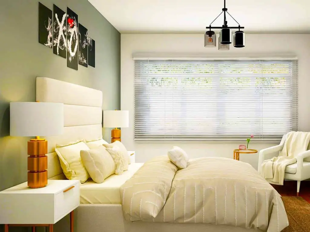
If in doubt or aiming to sell your house before you next decorate, opt for contemporary neutrals in light taupe (Pantone 7563 C), cream (Pantone 2001 C), or grey (Pantone 4114 C).
These colors form a backdrop to almost any bedroom theme, and you can easily change your fabrics and furniture for a radical new look.
Bedroom Color Schemes by Country
Picking bedroom colors for the walls can act as a backdrop to encourage the impression of a bedroom decorated in the style of a favorite country.
You can have fun showcasing your favorite items from your travels or enjoy collecting items to create a room with a story.
African Bedroom Colors
When you think of Africa, do you imagine bold animal prints, vibrant, multi-colored cottons, or dark, heavily carved furniture?
No one style screams Africa, and there is a wide variety of bedroom wall colors that provide the perfect backdrop for your African décor.
Wall and ceiling colors:
- White or soft cream (Pantone 7401 C) – a neutral backdrop for the boldest of furnishings and perfect for rooms worth plenty of dark wood.
- Soft old gold (Pantone 7406 C) on the walls – recreates the warm glow of the African sun.
- Dark grey (Pantone 4139 C) – is neutral and showcases the most vibrant cotton furnishings.
- One feature wall in caramel brown (Pantone 153 C) – perfect with vibrant fabrics with hot orange (Pantone 1375 C) splashes.
Accessorize with wooden carvings and colorful woven baskets.
Moroccan Bedroom Colors
The Moroccan style is ornate metal lampshades, decorative tiles, intricately pierced wood, and heavily embroidered patterns and fabric.
Consider splitting the colors on your walls with a neutral cream base and bands of more vibrant color at the bottom or a patterned strip further up the wall.
Colors to include in your bedroom scheme:
- Fuchsia pink (Pantone Rhodamine Red C) with gold accents.
- Aubergine (Pantone 7435 C) feature wall with lighter dusky pink (Pantone 501 C).
- Sky blue (Pantone 2925 C) walls with a lime green (Pantone 2270 C) ceiling embellished with gold accents and panels.
- Soft peach (Pantone 150C) walls are the ideal backdrop for brightly colored tiles.
- Darker blues (Pantone 2370 C) with sumptuous dark red (Pantone 187 C) and orange (Pantone 3564 C) soft furnishings.
- Taupe (Pantone 2431 C) walls let brightly embroidered silks shine like jewels.
Mexican Bedroom Colors
Hot, warm colors as bright as a fiesta or a bowl of peppers typify the Mexican palette.
Although most people think of bedrooms in terms of cool, relaxing hues, hot Mexican colors are uplifting and banish winter chills with their sunny, opportunistic vibe.
- Red (Pantone 2035 C) – seen on the flag and the vibrant chili pepper, used as a feature wall or an eye-catching band or panel.
- Yellow (Pantone 109 C) – sunny shades make your bedroom sing with heat and the desire for a long lazy siesta.
- Muted orange (Pantone 1575 C) – the old shade that bright orange paint fades to when exposed to years of sunlight. A strong, vibrant color deployed with care is a beautiful backdrop for bright ceramics and colorful woven blankets.
- Turquoise (Pantone 299C) – a blue as blue as the sky and sea lifts the spirits and is surprisingly relaxing.
Indian Bedroom Colors
There is no one color scheme typical Indian décor because India embraces all the rainbow colors and makes brightly contrasting colors work in harmony.
- Hot pink (Pantone 240 C), turquoise (Pantone 299 C), and gold accents.
- Reds, purples, and bright yellow.
- Dark blue with white patterns and metallic accents.
The best way to pick colors for your Indian-themed bedroom is to choose a piece of patterned sari silk and color match.
French Bedroom Colors
French country colors mix creams (Pantone 7401 C), washed-out lemons (Pantone 114 C), and cornflower blue (Pantone 7451 C).
Typically, the bedroom wall colors are muted and washed out, whether French country or Parisian style.
You can pick any color provided it is faded and pale – think lavender (Pantone 2072 C) instead of deep purple (Pantone 3515 C).
Italian Bedroom Colors
Italian decorating styles depend on which part of Italy you take as your inspiration. Italian bedrooms are clutter-free and enjoy natural light. Color choices include:
- Rose pink (Pantone 494 C) walls with turquoise (Pantone 299 C) shutters for a Tuscan farmhouse vibe.
- White for a fresh, clean, modern style.
- Soft toffee (Pantone 2431 C) for a warm and inviting retreat.
- Pale grey (Pantone 7543 C) for a serene backdrop to warmer colored furnishings.
German Bedroom Colors
German interiors focus on functionality and plenty of natural materials. The color palette is a celebration of brown in all its richness consider:
- Chocolate (Pantone 492 C), nut (Pantone 696 C), or terracotta (Pantone 7626 C) for a feature wall.
- Vanilla (Pantone 2015 C), sepia (Pantone 157 C), and latte (Pantone 2431 C) for subdued background color.
- Prussian blue (Pantone 2685 C), rich purple (Pantone 2607 C), and cherry (Pantone 1945 C) for deeper accents, mainly in soft furnishings and rugs.
Greek Bedroom Colors
The essential Greek look is blazing white walls with azure blue (Pantone 2132 C) accents on shutters and bedding.
The décor comes from the need to stay cool and reflect the heat of the sun.
Greece is essentially a coastal country, and the blue reflects the deep love of the sea.
Russian Bedroom Colors
Russia is a vast country but loves rich dark colors and a hint of luxury – think Faberge egg and thick velvet drapes.
Russia is a country that embraces color, so if you are planning a Russian bedroom with colorful art, velvet, tiles, and oriental rugs, you need to think about a neutral backdrop.
The best neutral wall colors include cream, white, and a dusky yellow (Pantone 128 C).
Chinese Bedroom Colors
Chinoiserie, or “Chinese-like” dominated European fashions in the 19th century with colorful silk fabrics, exotic furniture, and beautiful rugs.
Bright red lacquer, gold, white and black accents are the classical Chinese color scheme in western eyes.
Combined with a dark wood floor and your Chinese bedroom is dramatic and striking.
However, if you want to showcase sumptuous brightly colored silks and soft furnishings, a more neutral color scheme around cream, coffee, or grey works well.
Spanish Bedroom Colors
Dark wood, wrought iron, and earth colors with tiled floors are the basis of the Spanish look.
Warm colors on the walls include:
- Creamy yellow (Pantone 2001 C)
- Terracotta (Pantone 1575 C)
- Plum (Pantone 220 C)
These plain colors set off vibrant tiling with pops of primary colors.
Japanese Bedroom Colors
Japanese décor in the west is minimalist and clutter-free, with a black, grey, white palette and a splash of red as an accent.
The Japanese prefer natural earth colors and a palette of warm browns.
Japanese cottons and kimonos are brightly colored and change with the seasons so that a fresh spring Japanese-style bedroom would use accents of fresh green (Pantone 2268 C).
Cultural and Emotional Color Themes
Some themes may suggest a country, but really it is more about a culture or a way of thinking.
These are the names that give you a set of images and emotions to go with the name.
Scandinavian Bedroom Colors
Fresh, clean, and full of light is the trademark Scandinavian style; in bedrooms, this means white with the slightest touches of grey, pale blue, and perhaps a black accent.
Scandinavian bedroom colors mimic the freshness of a winter landscape.
Vintage American
Vintage America is faded denim, stars and stripes, and sun-bleached colors.
- Blue (Pantone 2148 C) – think washed blue jeans, new blue jeans, and dusty blues of all shades.
- Cream (Pantone 155 C) – thick and slightly yellow like the best ice cream.
- Military grey (Pantone 444 C) – darker shades best for a single wall rather than an entire room.
- Viridian green (Pantone 556 C) – washed-out military jackets.
Rustic Bedroom Colors
You can get rustic American, Italian, French, or Spanish. All countries have a “rustic” style suggesting farmhouses and the rural idyll.
The rustic color palette across the world includes:
- Warm earth colors – reddish and yellowish browns.
- Blue and white – tiles, crockery, and bed linen.
- Sun-bleached greys, blues, and greens.
Coastal Bedroom Colors
The house may not be on the beach, but many people try to recreate that life on the beach feeling in their bedroom décor with coastal motifs and beach colors.
For your walls, try:
- Dazzling white.
- Sandy brown (Panton 7752 C).
- Deep blue (Pantone 7706 C).
- Teal (Pantone 561 C).
Simple Shaker Style
The shaker style relates to minimalist, functional furniture with clean lines and tapered legs.
The furniture is complemented in the bedroom by plain walls and fabrics.
Consider:
- Cream.
- Dark Grey.
- Olive green.
- Silver grey.
- Mint green.
- Light blue.
Romantic Bedroom Colors
Romance means different things to different people, but you can expect frills and flowers in most romantic bedroom schemes.
Possible romantic bedroom color choices include:
- All the pinks from the palest blush of rose through peachy tones and approaching red.
- Pale greys and blues work well if combining romance with filmy voile curtains and four-poster beds.
- Pearlescent paint finishes (pearl white and dove grey) reflect candlelight and sunlight to produce a magical atmosphere combined with crisp white bed linen and a blood-red rose.
Arabian Nights
A Moroccan or Indian color scheme with plenty of tent-like drapes, mounds of silk cushions in jewel tones, and metal lamp shades allow you to create a bedroom worthy of any tales from the Arabian Nights.
Zakka or Wabi-Sabi
Zakka or miscellaneous things is a Japanese approach to displaying objects in the home – typically items that are simple in design and in some way improve your life through giving you joy.
Wabi-sabi is more challenging to define as it is a feeling of appreciation for old and worn-out objects, simple crafts, and a quiet life.
Defining bedroom colors and mood allows you to approach the essence of Zakka and Wabi-Sabi.
The color palette is muted greys, soft whites, and washed-out blues.
Imagine the colors of driftwood, pebbles, and sun-bleached cloth, and you get an idea of the joy of a well-loved home.
Feng Shui
Many people like a system for purposeful bedroom colors. Feng Shui is not an interior design tool, although it may seem like it.
Arranging your bedroom to promote harmony and well-being may seem a little too New Age, but some of the principles of Feng Shui have psychological and scientific backing.
Placing your bed so your head is against a wall makes for a restful night’s sleep by reassuring your subconscious that you are safe from predators.
This position recreates the security found by our early ancestors sheltering in caves.
Ideal bedroom wall colors for Feng Shui are the calming and restful beige, powder blue, cream, and dusky pink that work in so many other interior design themes.
Swinging Sixties
Vintage, retro, and psychedelic patterns all evoke the mood of the sixties. The sixties is not one look, but it depended on your country and your fashion sense.
A Southern California vibe uses a palette of tangerine, chartreuse fabrics with off-white walls.
Alternative color schemes involve hot pink and lime green with a splash of acid yellow.
Sixties colors are bold and vibrant and best shown in moderation against neutral walls.
Fabulous Fifties
Film star glamor with rich colors – if you have a large enough room embrace rich jewel tones:
- Teal with white furniture.
- Wine red and grey with dark furniture.
- Pastel peach with oyster silk drapes and bedding.
Practical and Functional Bedroom Colors
Not everyone wants or needs to approach their bedroom design as an artwork.
Sometimes you want a clean, fresh room that provides you with somewhere to sleep and relax; other times, you are decorating for someone else – a child or potential guests.
Bedrooms for Baby
If you know the gender in advance, you can opt for a pastel pink or blue color scheme.
But, if you plan to have more than one child, the exquisite pink for a baby girl is not as suitable for her baby brother.
Other baby-friendly color schemes include:
- White or cream – a neutral base, and you can change the bed linen to pink or blue to reflect gender. Plus, it transitions well for toddlers and older children with minimal design tweaks.
- Lemon shades – fresh, clean, and uplifting. You want your baby to sleep, so avoid hot, lively yellows and oranges.
- Mint green – green shades are soothing and promote restful sleep. You can add touches of pink to a mint green color scheme, but blue does not mix as well.
- Lilac and pale lavender – suitable for both boys and girls and accepts splashes of brighter primary colors.
- Pale greys – a neutral base for all design options and is restful on the eyes. Grey is an excellent background color if you want to add colorful wall panels to reflect your child’s changing interests.
Neutral colors for baby bedrooms allow you to update the room in line with your growing child.
Hardwearing and washable paint finishes cope well with the messes even a well-behaved child generates.
It is tempting to decorate a baby’s bedroom with bright primary colors and cartoon characters on the walls, but if you do, plan to redecorate as your child grows.
Plus, a bedroom with loud colors does not promote the restful sleep necessary to refresh your child and yourself.
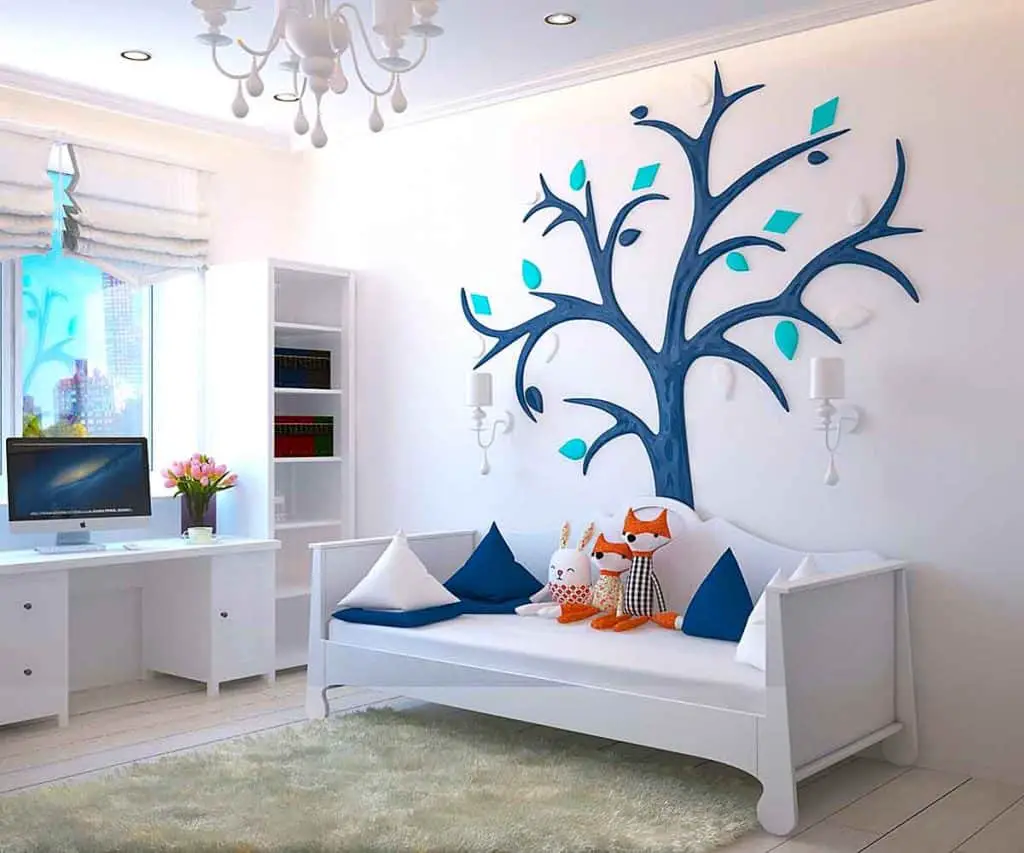
Children’s Bedrooms
It is fun to indulge your child with a dream bedroom for your little princess or wannabe racing driver.
Perhaps your child loves dinosaurs or superheroes, and most children love bright colors.
Creating a feature wall of princess pink or jungle green can please your child and leave you with minimal redecorating when the current childhood craze gives way to another.
Teenage Bedrooms
A neutral pale color on the walls allows your teenager to express themselves through bedding, posters, and other accessories.
Whether your teenager prefers moody blacks or shocking lime, you can roll through the storms of teenage life and remain with a neutral base for a guest bedroom or study when they move onto college, university, or work.
Master Bedrooms
Choosing paint colors for a master bedroom is about your personality.
It is your space, a sanctuary, and it depends on what you want from your room – quiet relaxation or a display of hidden passions.
The bedroom color scheme or theme that appeals to you is best for the master bedroom.
Guest Bedrooms
Mature bedroom colors are best for a dedicated guest bedroom.
These colors work for alternative uses of your guest bedroom if that room also serves as a craft room or study.
Plain walls in dusky colors of pink, lavender, blue, or green provide your guests with a restful night’s sleep and cover all genders and ages.
Small Bedrooms
Choosing paint color for a small bedroom means increasing the feeling of space, and it is best to avoid dark colors.
Neutral walls of tinted white give a fresh, airy feel to the smallest rooms; any color provided it is barely visible and paint with a soft sheen to reflect the available light.
A bright throw can change a small bedroom into a vibrant and welcoming space without restricting the feeling of space.
Typical Design Questions About Bedroom Colors
Decorating a bedroom is exciting, giving you a chance to display your taste and style.
You can take risks with your bedroom colors because this is a private space, and you can indulge yourself.
But decorating and interior design can be expensive, and you want a bedroom color scheme that works for daily life – especially if it is your bedroom.
Matching Bedroom Colors to Furniture
If you invest in your bedroom furniture before choosing the ideal colors for your bedroom, you need to think about what color schemes complement your furniture.
What color to paint bedroom with black furniture?
Bedroom colors to match black furniture range from rich purples, reds, deep blues to the more subtle off-whites and light grey tones. The African, Mexican, Spanish, and Chinese color palettes all work beautifully with black furniture.
What wall color goes with white bedroom furniture?
Color to match white bedroom furniture is more challenging—contemporary white bedroom furniture suits the Scandinavian style and any neutral color tones. The white and gold French bedroom furniture is ideally matched with sea green, jade, and cornflower blue.
What bedroom color goes with brown furniture?
Bedroom colors to match brown furniture cover all the range of bedroom colors because most bedroom furniture is brown.
The precise matching bedroom colors for your brown furniture depend on the type of brown furniture you choose.
Pine starts pale but ages to a honey gold and is beautifully highlighted by both pale and rich colors. Mahogany is darker and complements jewel tones but provides dark accents to a white color scheme.
Most wooden bedroom furniture will match most bedroom décor if you match the right shape and style.
How Many Colors Should You Have in a Bedroom?
In theory, you can have as many colors as you want in a bedroom, but it is best to fit to a restricted, balanced color palette in practice.
One handy hint is to choose an odd number of colors – this rule works for flower arranging, painting, and any other creative art; odd numbers work better than ones.
Three colors are straightforward to harmonize.
The designer rule is to use 60% of your dominant shade (ideal bedroom wall colors), 30% of your secondary color (deeper shade – picks out features, bedding, or single wall), and 10% of a splashier accent color to pull your bedroom color scheme together.
Repainting the bedroom is a straightforward but valuable opportunity, particularly for long-term renters to turn a rented house into a private sanctuary.
Should Bedroom be Warm or Cool Colors?
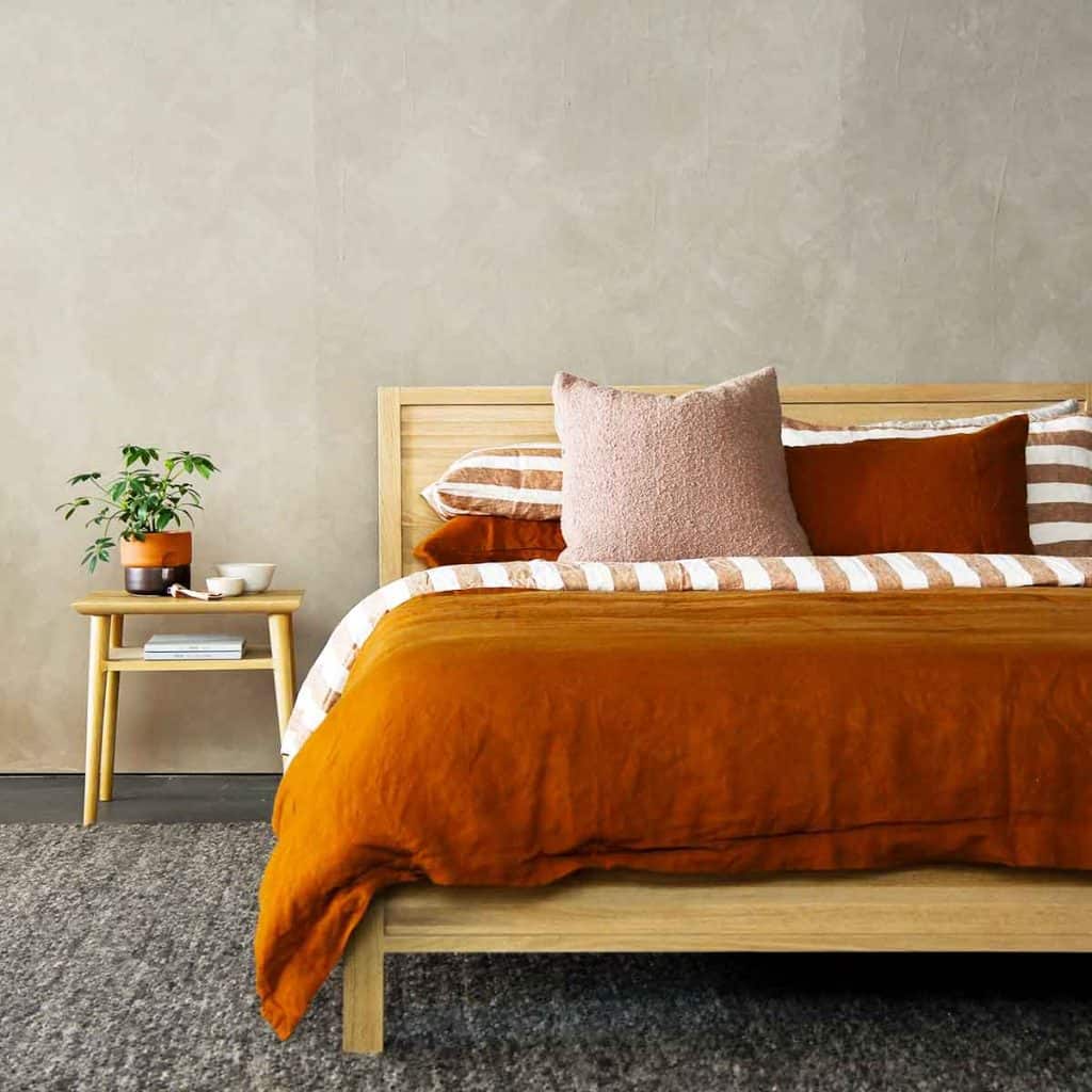
Although red and orange are typical warm colors, other colors like rich browns also fall into the warm category.
The cooler colors of grey, blue, and green are often subdued, but you can get warm versions of these colors depending on the hue.
Warm vs. Cool depends on the bedroom colors and moods you want to show. Warm colors are brilliant for producing a cozy feeling and cool for freshness.
There are no wrong colors, and neither warm nor cool is the best choice – it depends on what you want to do with your bedroom theme.
Should Bedroom and Bathroom Colors Match?
Assuming you are thinking about an ensuite bathroom, it is reasonable to assume that it is part of the bedroom color scheme.
The bathroom is generally a separate room with a door to keep the moisture safely out of the bedroom.
You can use a completely different color scheme for the bathroom. Still, in the interests of a unified experience, it is better to have an attached bathroom and bedroom complementing each other in terms of style and color.
The bedroom does not have to match the living room colors, but always approach your bedroom and bathroom color scheme decisions collectively.
Can You Mix Wood Colors in a Bedroom?
You can mix wood tones in any room, but it helps to pay attention to shade, grain, finish, and furniture style.
Wood tones are warm, cool, or neutral – stick to warms or cools for the dominant wood furniture and floors. You can play around with accent contrasts if your decorating approach is more experimental.
Soft furnishings can help pull different woods together into a more cohesive look.
Warm wood tones are yellowish and reddish – cherry and mahogany, for example. Ash and maple are cooler and paler in tone.
Mixing wood tones in a bedroom is acceptable, provided the contrast is not glaring. Wood is a natural material and changes with age, so unless you buy all your bedroom furniture in one wood, there will always be contrasting tones.
Don’t worry, trees in a forest don’t clash.
Finally
Whatever theme you choose for your bedroom and how you mix and match your colors should make you feel good about hanging out in the best room in the house.
If you find that the perfect wall color is less than ideal, don’t worry – you can tone it down or liven it up with pictures, panels, and drapes.
Plus, all colors change after a few years of exposure to sunshine that too-bright orange will soften with time.
When it is time to redecorate in a few years, you will have new favorite objects and colors.
References:
https://brightside.me/article/one-fascinating-test-to-find-out-how-many-colours-you-can-see-28105/