
Colors for (Profession-Specific) Offices & Waiting Rooms
“Color rings the doorbell of the human mind and emotion and then leaves.”
Faber Birren, American author and scholar on color theory.
Great artists, renowned poets, and design luminaries–from Georgia O’Keefe, Paul Gauguin, Wassily Kandinsky, and Emily Dickinson to Celerie Kemble and Coco Chanel have eloquently captured the meaning that colors bring to our lives.
They pay tribute to color’s powerful ability to evoke emotions.
As Henri Matisse suggests below, color does much more than expressing the phenomenon of light. Instead, it evokes thought processes and emotions.
“Color helps to express light – not the physical phenomenon, but the only light that really exists, that in the artist’s brain.”
Henri Matisse
Not everyone is an artist, of course, but you can use the power of color to help add to the comfort of people around you under what may sometimes be stressful situations.
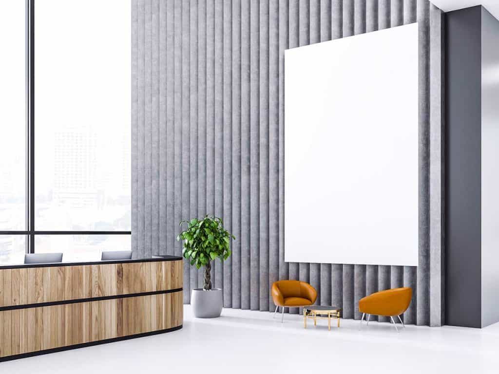
Professional Waiting Rooms
Not everyone enjoys spending time in a waiting room.
By definition, waiting is frustrating, particularly when you don’t know how long the wait will be.
You try to distract yourself by reading emails, texts, or news or using apps on the smartphone, although some waiting rooms don’t allow cell phone use. And if there are magazines available, they tend to be incredibly outdated.
With the time slowing to a crawl with little or nothing to distract, you begin to worry about everything you should be doing rather than simply waiting.
Thus, waiting rooms must be inviting and comfortable and appropriately reflect what an organization or business represents and offers.
That is where color choices come into play. They have a psychological impact, evoking an emotional response that can affect mood, demeanor, and behavior.
Best Paint Color for Waiting Room
If you intend your visitors to feel relaxed and at home, painting your office walls in bold red is not a good choice. As the warmest color, red may contribute to anxiety and body tension.
It conveys excitement and energy and tends to raise heart rate, blood pressure, and metabolism. The latter is why many restaurants use red, encouraging appetite, stimulation, and discussions among people – the opposite aim for people waiting for their appointments.
Instead, these paint colors suit waiting rooms:
- Soft blue or blue-green – peaceful colors reduce anxiety, lower blood pressure, and slow heart rate, creating a stress-free waiting room.
- Light or dark greens with pale yellow or beige overtones – subtle colors that reduce stress.
- Grayish off-white with white – the combination of light colors that is soothing yet professional-looking. Excessive white is glaring and best avoided.
- Light gray with dark blue highlight – professional-looking colors that inspire trust.
- Off-white with lavender or soft lilac shade – relaxing colors that suit therapy-related businesses.
How about the color pink?
That depends.
Pinks that are close to red, such as bright or dark pinks, may increase blood pressure and contribute to body tension. Yet soft, muted, pastel pinks have a calming, restful impact.
You can also mix a wide range of unique colors to achieve different moods for the room.
Color Brightness vs. Saturation
Don’t forget the importance of color saturation and brightness.
Color brightness is self-explanatory, which refers to the lightness or darkness of a color. The intensity of a hue or color gives you saturation – the higher the saturation, the more vivid the dominant color becomes. Decreasing a color’s saturation turns it paler or the dominant color less intense.
Mixing any color with white reduces its contrast, thereby lowering its color saturation. Yet mixing any color with black lowers its intensity and reduces color saturation.
Red plus white leads to the less saturated color pink. When you add black to bright red, the result is a less saturated dark red.
Shades matter, and too much color stimulation is counterproductive to creating calmness.
Colors tend to be more pleasant if they are relatively bright yet not highly saturated. For example, blue-purple evokes a different emotional effect than red-purple.
Colors to Match Your Brand
When selecting a paint color, ask yourself what message you’d like to convey about your brand or organization.
For example, do you want to establish a sense of security and honesty?
If so, darker blues can demonstrate dependability, professionalism, strength, and honesty, whereas light blue shades convey relaxation and freshness.
Paint Colors for Professional Offices
Best Colors for a Medical Doctor’s Office
For medical offices, you should consider colors that inspire a sense of relaxation and tranquility.
Light, soft blues are calming, and bluish-green tones can be reassuring and are the best colors for a doctor’s office. Soft, neutral shades of green, blue, gray, and beige can achieve the goal of making visitors feel that they’re in a large living room rather than a sterile medical facility.
Best Colors for a Dental Practice
Many dentist offices are moving away from neutral gray, beige, brown, and black.
Instead, choose more dynamic colors based on research that appropriate use of color can relieve stress and fatigue, improve efficiency and effectiveness, and result in a happier demeanor.
While it is essential to avoid a monotonous color scheme, too much color stimulation is not recommended.
When designing a dentist’s office, you will want to pick paint colors that achieve a sense of relaxation and comfort, such as soft shades of blue, green, or blue-green – combined with an off-white base for the best colors for a dental office waiting room.
If you prefer bolder colors, orange and yellow can add a fun touch. But if the shades are too bold, the result may be anxiety and increased stress and tension.
Best Colors for a Lawyer’s Office
Consider selecting dark browns, greens, or blues for a law office. Dark blue shades establish professionalism and dependability while adding dark shades of green can convey a sense of security and honesty.
Adding warm colors rich in tone, including gold or burgundy, can also give the office a sense of authority.
Best Colors for an Accountant’s Office
Many accountants’ offices tend to use neutral, natural colors, including beige, browns, and creams, to convey a refined look. But some may consider these colors relatively dull.
Consider using dark greens or navy blue complemented with the slightly warmer yet not over-saturated beige off-white to communicate security, confidence, professionalism, prestige, and responsibility for an accounting office.
Best Colors for an Optometry Office
Optometrists, by profession, understand the importance of optics.
Many tend to use neutral colors or off-white with a few bursts of warm or cold colors, such as cool blues and cherry or soft oranges, to establish a visually appealing, calming, yet bright optometry office.
Best Colors for a Chiropractic Office
Your color choices must be complementary. Otherwise, patients may feel stressed, anxious, or uneasy.
As with other healthcare settings, the goal is to help chiropractic patients feel relaxed and motivated to take the necessary steps to improve their health.
Once again, painting the walls red is never a good idea in such an environment since it may trigger feelings of energy and tension and represents a tendency toward pain.
However, achieving a balance between both warm and cold colors will help patients feel less anxious.
Consider combining cool colors like blues, blue-green, greens, lavender, grayish-blue, and neutral colors such as warm beiges to convey peace and tranquility in your chiropractic office.
Best Colors for a Pediatric Office
Selecting an appropriate color for a pediatric office can present its unique challenges.
For example, using large quantities of yellow in a dentist’s office is probably not the right choice since it may contribute to tension or anxiety.
Yet using vivid, “sunny” yellow as highlights may be perfect for a pediatrician who wants to help create a kid-friendly environment. Children tend to be stimulated by bright colors, and yellow, orange, reddish-brown, and purple are popular choices for a pediatric office since they evoke a feeling of cheerfulness and joy.
Beware of overdoing, though, since too much stimulation in the waiting room can lead to agitation and irritability.
You can also consider soft purples to help trigger creativity. Research suggests that purple is the favorite color of nearly 75% of pre-adolescents.
Best Colors for a Therapy Office
If you are a physical therapist, you will want to consider choosing bright, vivid, and bold colors that promote energy, inspiration, and adrenaline, balanced with cool, relaxing, or relatively neutral colors for the therapy office.
For example, consider selecting warm greys or beiges and adding an accent wall painted with a soft blue, green, purple, or even a bold, intense orange if you feel adventurous.
Best Colors for a Psychotherapy Office
Choose soothing, gentle, light colors, such as dusty bluish-gray or soft sage green, to reduce stress and evoke a sense of relaxation and comfort for a psychotherapy office.
Also, be sure to fill the room with natural light. If you do not have windows, use soft lighting, such as light bulbs that simulate natural light, rather than harsh, fluorescent lighting.
Best Colors for a School Counselor’s Office
Particularly if your office is small, consider an off-white shade (and, if possible, a mirror on the wall) to make the room look bright and roomier than it actually is.
You could add an accent wall in a soothing, muted color such as soft blues, greens, or blue-grays to obtain an appropriate balance.
Best Colors for a Sales Office
Being an effective salesperson requires being creative and flexible, adjusting the sales pitch to fulfill every potential buyer’s unique needs.
Green is a soothing color that improves focus, perfect for people who need to work long, productive hours.
It is widely accepted that red powerfully drives sales since it promotes action and energy. However, red is a potent motivator that, if not used with restraint, can reduce analytical thinking, which in turn can make it more difficult to make purchasing (and other) decisions.
Consider adding a somewhat muted red or orange to achieve the proper balance.
Blue and beige, which is the overwhelming favorite color for the majority, are always a good option, albeit a safe one. It promotes trust and communication, both of which are crucial for successfully making sales.
Ultimately, the best colors for a sales office will heavily rely on your product’s color palette for consistency and cohesiveness, which is more confidence-inspiring for your prospective customers.
As a rule of thumb, do not select white. Researchers have found that employees are more prone to make errors when working within purely white walls. Apply office colors that enhance productivity and creativity instead.
Many people also find white dull, often suggesting to potential clients and buyers that the business or company lacks personality, creativity, and flexibility. Not a good look at all.
Sales offices can use an off-white base with minimal accent colors that correspond with the brand color and let the product models take center stage.